Have you ever wondered how traders predict currency price movements with just a glance at a chart? In this guide, we'll walk you through exactly how to read currency exchange charts, helping you decode the language of the markets and turn that complex data into confident decisions.
These charts are like a roadmap, guiding you through the ups and downs of currency pairs with clarity and precision. Whether you’re curious about forex trading or simply want to master the skill of analyzing global markets, this is your perfect starting point.
Key takeaways:
- Understanding charts: Currency exchange charts visualize price movements of currency pairs over time, with the y-axis showing exchange rates and the x-axis representing time, crucial for spotting trends and market sentiment.
- Currency pairs: Charts display pairs like EUR/USD, where the base currency (e.g., EUR) is compared to the quote currency (e.g., USD), with rates indicating how much of the quote currency buys one unit of the base.
- Chart types: Line charts show long-term trends, bar (HLOC) charts detail price ranges, candlestick charts reveal market sentiment, and mountain charts offer a visual overview of closing prices.
- Key elements: Focus on HLOC (high, low, open, close) data, timeframes (from minutes to months), and price movements (uptrends, downtrends, or sideways) to analyze charts effectively.
- Patterns: Recognize patterns like doji candlesticks (indicating indecision), long candlesticks (showing momentum), support/resistance levels, and chart patterns (e.g., head and shoulders, triangles) for predicting price movements.
- Practical tips: Start with simple candlestick charts, use reliable platforms like TradingView, combine with indicators like RSI or moving averages, and practice regularly to build confidence.
- Forex indicators: Tools like moving averages, RSI, and MACD enhance chart analysis by confirming trends and signaling potential trade opportunities.
- Avoid mistakes: Don’t overload charts with indicators, choose appropriate timeframes, and use trusted data sources to ensure accurate analysis.
1. What are currency exchange charts?
Currency exchange charts are powerful tools that help traders visualize the price movements of currency pairs over specific periods. If you’re wondering what is a forex chart? it’s essentially a graphical representation of exchange rates over time, showing how one currency compares to another.
For those wondering how to read currency exchange charts, understanding their structure and purpose is the first step toward effective analysis. This section explores what these charts are and why they’re essential for forex trading.
Currency exchange charts plot the exchange rate of one currency against another on the vertical (y) axis, while the horizontal (x) axis represents time.
For example, a chart for EUR/USD with a rate of 1.20 shows that 1 euro can buy 1.20 US dollars over a chosen timeframe, such as minutes, hours, or days.
These charts summarize all market activity, including buy and sell transactions, reflecting supply and demand movements. To a trader, a chart is more than just data; it's the story of supply and demand, reflecting both known news and the market's collective expectations and that is the core value of technical analysis.
Why do these charts matter? They allow traders to study historical price behavior, identify trends, and assess market sentiment. By learning how to read a currency exchange chart, you can spot patterns that may signal future price movements, helping you make informed decisions.
2. Understanding currency pairs in charts
To truly master reading a chart, you first need a solid grasp of currency pairs the very foundation of forex trading. Let's look at what they are and how they appear on your charts.
2.1. What is a currency pair?
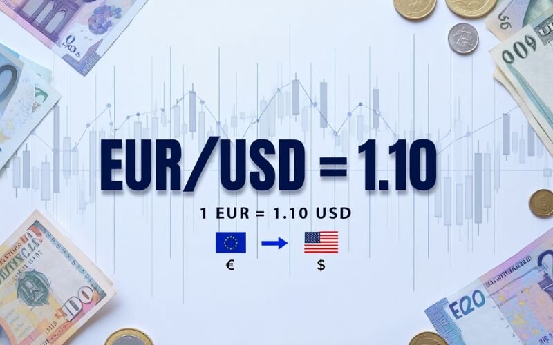
A currency pair represents the exchange rate between two currencies. By convention, this popular currency pair is written as EUR/USD, where EUR is the base currency and USD is the quote currency. Learning how to read currency exchange rates is key: the rate shows how much of the quote currency is needed to buy one unit of the base currency.
For example, if the EUR/USD rate is 1.20, it means 1 euro equals 1.20 US dollars. Currency pairs are the building blocks of forex, reflecting the relative value of one currency against another. This understanding is crucial for interpreting chart data and making sense of price fluctuations.
2.2. How pairs are displayed on charts
Currency pairs are plotted on charts to show how their exchange rates change over time. On a chart, the y-axis displays the exchange rate (e.g., EUR/USD at 1.20), while the x-axis tracks time, from minutes to months.
When learning how to read a currency exchange chart, notice how the pair’s price moves in response to market activity, such as buying or selling pressure. For instance, an upward movement on a EUR/USD chart indicates the euro is strengthening against the US dollar. Charts visually aggregate all market transactions, helping traders identify trends and patterns.
2.3. How do you read currency exchange?
Reading currency exchange involves interpreting the value of one currency relative to another, typically displayed in pairs like EUR/USD or USD/JPY. The first currency in the pair is called the base currency, and the second is the quote currency. The exchange rate tells you how much of the quote currency you need to buy one unit of the base currency.
For example, if EUR/USD is 1.10, it means 1 euro = 1.10 US dollars.
To read currency exchange effectively, especially in trading:
- Understand how currency pairs work (base vs. quote)
- Learn to read the charts that display exchange rate movements
- Identify patterns, trends, and price zones like support and resistance
- Use indicators and timeframes that align with your goals
3. Types of currency exchange charts
Understanding how to read currency exchange charts involves knowing the different types of charts available and their unique features. Each chart type presents price data differently, offering insights into market trends and behaviors.
This section explores the three main types of forex charts most commonly used: line, bar (HLOC), and candlestick. Additionally, we will also cover the mountain chart, a visual variation of the line chart.
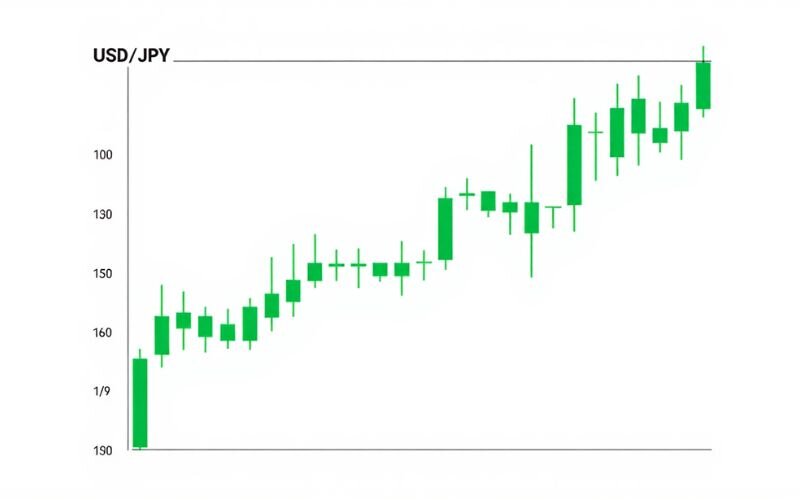
3.1. Line chart
A line chart is the simplest way to visualize currency pair price movements. It connects only the closing prices over a chosen period, forming a continuous line.
This means for each time interval (e.g., one hour, one day), the chart plots just the closing price, ignoring the highs, lows, and opening prices. This unique characteristic makes it easy to track general price direction over time.
When learning how to read currency charts, line charts are ideal for spotting long-term trends due to their clean, uncluttered display. They help traders and analysts see the “big picture” of market behavior without being distracted by short-term volatility.
However, since line charts do not have detailed period data, they are not suitable for short-term trading strategies that require precise entry and exit points. For these purposes, candlestick or bar charts simply provide far more actionable insights.
3.2. Bar chart (HLOC)
Bar charts, also known as HLOC (high, low, open, close) charts, provide more detailed information than line charts. Each bar represents a time period, with a vertical line showing the high and low prices, and horizontal notches indicating the open and close prices.
A single bar is composed of:
- The open price is represented by the notch to the left of the vertical line
- The close price is represented by the notch to the right of the vertical line
- The high price is the uppermost point of the vertical line
- The low price is the lowest point of the vertical line
This structure gives traders a clearer picture of price volatility and how prices evolved within a specific timeframe.
Learning how to read a currency exchange chart like this helps traders assess momentum and range. A green bar (close > open) signals upward movement, while a red bar (close < open) indicates downward pressure. Bar charts are especially useful for identifying price swings and determining market sentiment during different sessions. Bar charts provide more detailed information than line charts.
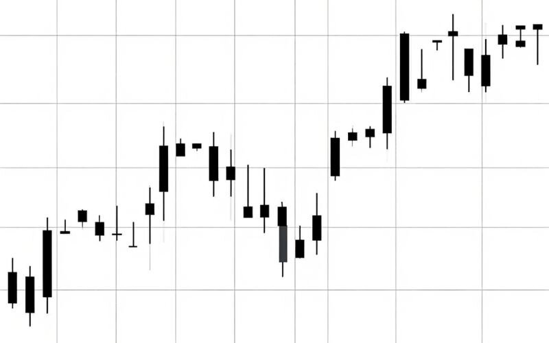
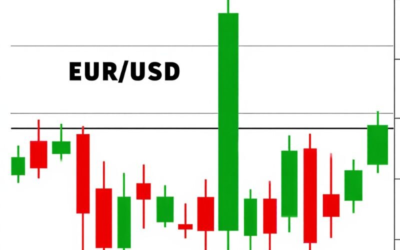
3.3. Candlestick chart
Candlestick charts are a favorite among forex traders due to their rich visual detail and ability to convey market sentiment at a glance. Each candlestick summarizes four key price points in a selected timeframe:
- Open: The price at the start of the period.
- Close: The price at the end of the period.
- High: The highest price reached during the period.
- Low: The lowest price reached during the period.
The body of the candlestick represents the range between the open and close prices, while the wicks (or shadows) above and below show the high and low of the session.
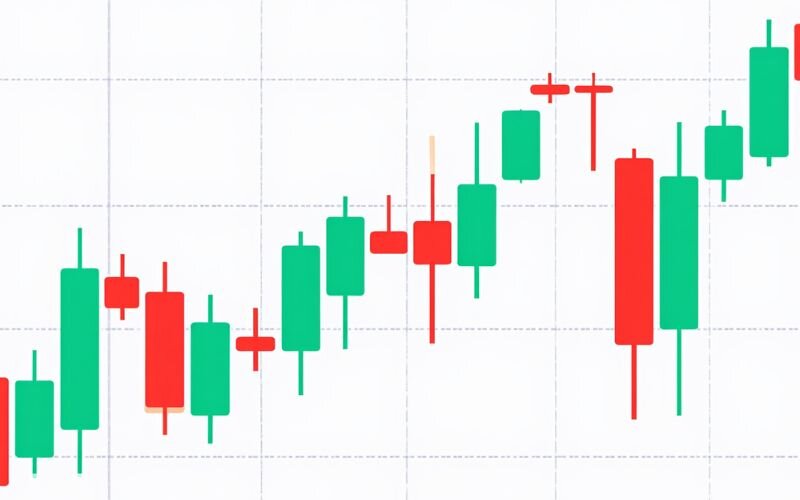
3.3.1. Green vs. Red Candlesticks
- A green candlestick (also called a bullish candle) means the close price is higher than the open - signaling buying pressure or upward movement.
- A red candlestick (also called a bearish candle) indicates the close is lower than the open - signaling selling pressure or downward movement.
These color cues make it easier to spot short-term trends, shifts in sentiment, and potential reversals.
3.3.2. Doji Candlesticks
One special form of candlestick is the Doji, which occurs when the open and close prices are nearly identical. This forms a candle with a very small or nonexistent body. A Doji suggests indecision in the market and may signal a potential reversal, especially when it appears after a strong trend. However, it should be confirmed with other indicators or chart patterns for higher accuracy.
3.3.3. Heikin Ashi Candlesticks:
In addition to standard candlesticks, there’s also a modified version called the Heikin Ashi chart. Unlike regular candlesticks, Heikin Ashi uses averaged data to smooth out price action, making it easier to identify trends and reduce market noise.
Heikin Ashi candles are calculated differently:
- They blend data from the current and previous candles.
- As a result, trends appear more continuous, with fewer false signals.
- However, since they lag behind real prices, Heikin Ashi is better suited for trend-following strategies than for precise entries.
When learning how to read currency exchange charts, mastering both traditional and Heikin Ashi candlesticks can enhance your ability to adapt to different trading conditions.
3.4. Mountain chart
Mountain charts are similar to line charts but feature a shaded area beneath the line, resembling a mountain silhouette. They focus solely on closing prices, making them useful for long-term trend analysis but less detailed for short-term trading.
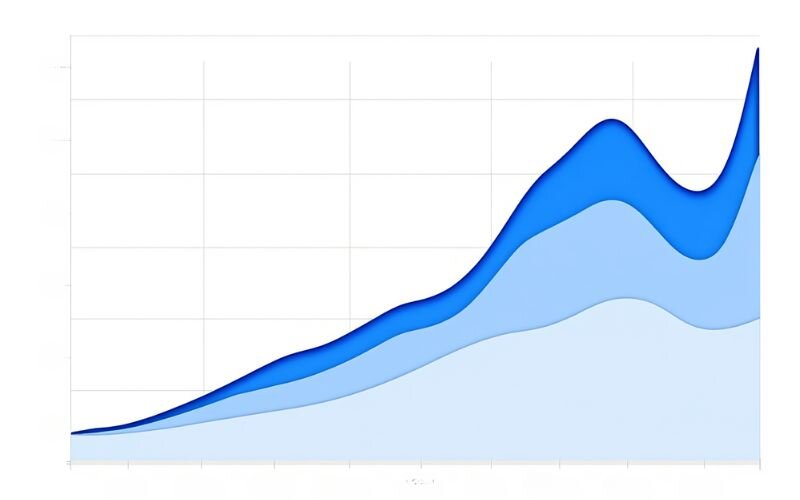
When exploring how to read exchange rate graphs, mountain charts offer a visually appealing way to track broad market movements. We find them less common but still valuable for strategic overviews.
View more:
- What time frame is best for demand and supply indicator?
- What is stop limit price in Forex? Guide for beginners
- Is margin still used when in floating profit? Full guide
4. How to read a currency exchange chart: Key elements
Mastering how to read currency exchange charts requires understanding the core components that shape their data. These elements provide the foundation for analyzing price movements and making informed decisions in forex trading.
This section dives into the key aspects of chart reading, including price data points, timeframes, and trend identification, to enhance your technical analysis skills.
4.1. High, low, open, close (HLOC)
The HLOC data points are the building blocks of most forex charts. When learning how to read currency exchange rates, focus on these:
- Open: The price at the start of a time period.
- Close: The price at the end of the period.
- High: The highest price reached during the period.
- Low: The lowest price reached.
For example, on a EUR/USD candlestick, a green body shows the close price higher than the open, signaling buying pressure (the euro is strengthening).
4.2. Timeframes
Timeframes determine how price data is displayed on a chart, from tick-by-tick to monthly intervals. Short timeframes (e.g., 5-minute charts) suit day traders, while longer ones (e.g., daily or weekly) are ideal for trend analysis.
Understanding how to read a currency exchange chart across different timeframes helps align your strategy with market conditions.
4.3. Price movements
Price movements reveal market trends, a critical aspect of chart analysis. Key patterns include:
- Uptrend: Higher highs and higher lows, indicating a rising price.
- Downtrend: Lower highs and lower lows, showing a falling price.
- Sideways trend: Prices fluctuate within a range, signaling indecision.
Learning how to read exchange rate graphs involves spotting these trends to predict future movements. For instance, an uptrend on a GBP/USD chart suggests the pound is strengthening.
5. How to read currency charts: Basic patterns
Recognizing patterns on currency exchange charts is a vital skill for traders aiming to predict market movements. These patterns reveal market sentiment and potential price shifts, helping you refine your technical analysis. This section explores key chart patterns to enhance your ability to read currency charts effectively, focusing on practical insights for forex enthusiasts.
5.1. Doji candlestick
A doji candlestick forms when the open and close prices are nearly equal, creating a small body or cross-like shape. When learning how to read currency charts, a doji signals market indecision, often hinting at a potential trend reversal.
For example, a doji after an uptrend on the USD/JPY chart could suggest a pause or reversal. Note that doji patterns are very powerful when combined with other signals.
Pros and cons of doji candlestick
| Pros | Cons |
|---|---|
| Easy to identify visually | Often needs confirmation from other indicators |
| Useful in spotting trend reversals | Can give false signals in choppy markets |
| Works well in multiple timeframes | Not useful on its own for trade entries |
5.2. Long candlesticks
Long candlesticks reflect strong market momentum. A long green candlestick shows significant buying pressure, with the close price much higher than the open, while a long red candlestick indicates heavy selling.
Understanding how to read a currency exchange chart with these patterns helps identify dominant market forces. For instance, a long green candlestick on EUR/USD suggests bullish sentiment.
Pros and cons of long candlesticks
| Pros | Cons |
|---|---|
| Indicates strong market sentiment | May follow a temporary price spike |
| Useful for spotting breakout moves | Can be misleading without context |
| Helps confirm trend strength | May not define exact entry/exit points |
5.3. Support and resistance levels
Support and resistance levels are price zones where the market tends to pause or reverse. Support acts as a price floor where buying interest emerges, while resistance is a ceiling where selling pressure appears.
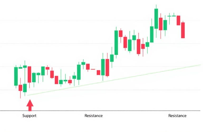
When mastering how to read currency exchange charts, identifying these levels helps predict price behavior. For example, GBP/USD may bounce off a support level at 1.30.
| Pros | Cons |
|---|---|
| Foundational concept in technical analysis | Not always easy to draw precisely |
| Useful for entry and exit strategies | Can be broken during high volatility |
| Applicable across all timeframes | Subjective interpretation by different traders |
5.4. Common chart patterns
Chart patterns like head and shoulders, double tops, and triangles signal potential price movements. A head and shoulders pattern on a EUR/USD chart may indicate a trend reversal, while a triangle suggests a breakout. Knowing how to read exchange rate graphs with these patterns enhances your predictive skills.
Head and Shoulders:
A head and shoulders pattern typically signals a trend reversal. It consists of three peaks: a higher middle peak (head) between two lower peaks (shoulders). It usually appears at the top of an uptrend and suggests a bearish reversal.
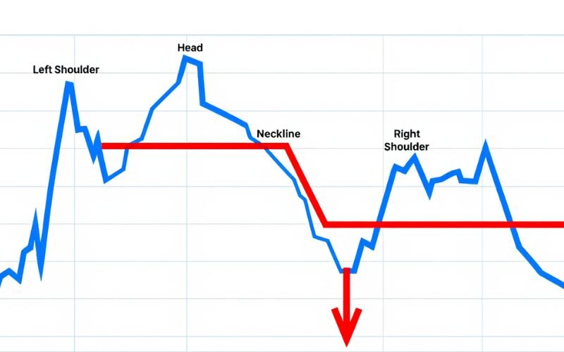
Pros and cons of head and shoulders
| Pros | Cons |
|---|---|
| Strong signal for trend reversal | Requires patience to fully form |
| Easy to recognize with practice | Can fail if neckline is broken too early |
| Effective across major currency pairs | False breakouts can occur in volatile markets |
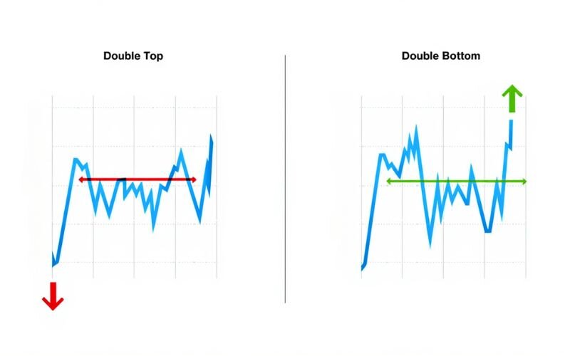
Double Tops and Bottoms:
A double top indicates a potential bearish reversal, forming an "M" shape, while a double bottom signals a bullish reversal, forming a "W" shape. These patterns reflect price rejection at key support or resistance levels.
Pros and cons of double tops/bottoms
| Pros | Cons |
|---|---|
| Common and easy to identify | Requires confirmation of breakout |
| Helpful in setting clear price targets | Can be invalidated by fakeouts |
| Works well in combination with volume indicators | May take time to form, causing delayed entries |
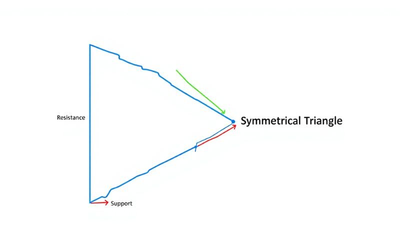
Triangles (Ascending, Descending, Symmetrical)
Triangle patterns represent consolidation before a breakout.
- Ascending triangle suggests bullish breakout
- Descending triangle implies bearish breakout
- Symmetrical triangle can break either way
Pros and cons of triangle patterns:
| Pros | Cons |
|---|---|
| Useful in anticipating breakouts | Direction is not always predictable (esp. symmetrical) |
| Applicable across timeframes | False breakouts are common in news-heavy periods |
| Can set measured move targets | Requires volume confirmation for reliability |
6. Practical tips for reading currency exchange charts
Applying effective strategies is key to mastering how to read currency exchange charts. For traders ready to deepen their technical analysis, practical tips can streamline the process and boost confidence. This section offers actionable advice to help you analyze charts efficiently, using reliable tools and consistent practice.
6.1. Start simple
When learning how to read a currency exchange chart, begin with straightforward chart types like candlesticks. Focus on understanding basic elements like HLOC data and trends before diving into complex patterns.
Overcomplicating your analysis early on can lead to confusion. We recommend starting with daily candlestick charts for clarity. Practice on demo platforms to build familiarity without risk.
6.2. Use reliable tools
Leverage trusted charting platforms to enhance your analysis. Tools like TradingView and MetaTrader offer user-friendly interfaces and real-time data, ideal for studying how to read currency charts. These platforms provide customizable timeframes and indicators to suit your strategy.
6.3. Combine with other analysis
Charts alone aren’t enough for robust decision-making. Combine chart reading with technical indicators like moving averages or RSI to confirm trends. For instance, a moving average crossover on a EUR/USD chart can validate an uptrend. Learning how to read currency exchange rates alongside indicators strengthens your analysis.
6.4. Practice regularly
Consistent practice is crucial for mastering chart analysis. Spend time daily reviewing charts to spot patterns and trends, such as support levels on GBP/USD. Join communities like H2T Finance’s Telegram group to discuss insights with others. Regular practice builds intuition, making it easier to read exchange rate graphs over time.
7. What are forex indicators?
Forex indicators are mathematical tools applied to currency exchange charts to help traders interpret price movements, confirm trends, and generate potential trade signals. When learning how to read currency exchange charts, these indicators act as a second layer of insight beyond just price patterns and candlesticks.
While charts show what the market has done, indicators help explain why and what might happen next. They are especially useful for identifying entry and exit points, confirming market trends, and spotting overbought or oversold conditions.
Below are some of the most commonly used forex indicators for beginners:
- Moving Averages (MA): Smooths out price data to show the average value over a specific period. A simple moving average (SMA) or exponential moving average (EMA) helps identify trend direction and potential reversals.
- Relative Strength Index (RSI): Measures the speed and change of price movements to detect overbought or oversold conditions. Values above 70 suggest overbought, while below 30 suggests oversold.
- MACD (Moving Average Convergence Divergence): A momentum indicator that reveals changes in strength, direction, and duration of a trend. It uses two moving averages to signal potential buy/sell opportunities.
- Bollinger Bands: These bands expand and contract based on market volatility. Price touching the upper band may indicate overbought conditions, while touching the lower band may indicate oversold conditions.
- Stochastic Oscillator: Compares a closing price to its price range over a set period. It helps detect trend reversals and momentum shifts, often used in conjunction with RSI.
Understanding and combining these indicators with price patterns on the chart improves the accuracy of your analysis. For example, spotting a bullish candlestick at a support level with RSI under 30 could signal a potential buying opportunity.
8. Common mistakes to avoid when reading charts
Even with a solid understanding of how to read currency exchange charts, traders can fall into common pitfalls that hinder effective analysis. Avoiding these mistakes is crucial for developing reliable technical skills. This section highlights key errors to steer clear of when analyzing forex charts, ensuring you stay on the path to confident chart reading.
8.1. Overloading charts with indicators
A frequent mistake is cluttering charts with too many technical indicators, such as moving averages, RSI, and Bollinger Bands. This can overwhelm your analysis, leading to conflicting signals and indecision. When learning how to read a currency exchange chart, stick to one or two indicators that align with your strategy.
8.2. Ignoring timeframes
Choosing the wrong timeframe can distort your chart interpretation. For example, a 5-minute chart may show noise, while a daily chart reveals a clear trend. Ignoring timeframes when studying how to read currency charts risks misaligned strategies. We recommend matching your timeframe to your trading goals.
8.3. Not verifying data sources
Relying on untrustworthy platforms can lead to inaccurate chart data, undermining your analysis. Always use reputable sources like TradingView or MetaTrader for reliable price information.
When mastering how to read exchange rate graphs, verify your data to ensure precision. Using trusted resources for market analysis is a critical principle emphasized by professionals and regulatory bodies.
9. Frequently asked questions (FAQs)
As you dive deeper into how to read currency exchange charts, you may have questions about the process. This section addresses common queries to clarify key concepts and guide your learning. These answers provide practical insights to help you analyze charts with confidence, tailored for those advancing their forex knowledge.
9.1. What is the easiest currency exchange chart for beginners?
Candlestick charts are the easiest for beginners due to their visual clarity and ability to show market sentiment. Each candlestick displays open, close, high, and low prices, making trends and patterns like dojis easy to spot. Their intuitive design helps new traders grasp price movements quickly.
9.2. How do I read currency exchange rates on charts?
To read currency exchange rates on charts, focus on the HLOC data: high, low, open, and close prices. For example, on a EUR/USD chart, an exchange rate of 1.20 means 1 euro equals 1.20 US dollars.
9.3. What timeframe should I use to read currency charts?
Start with daily charts for a clear view of trends, as they reduce market noise. As you gain experience, try shorter timeframes like 1-hour or 5-minute charts for specific strategies. Choosing the right timeframe depends on your goals.
9.4. Can I read currency exchange charts without trading?
Yes, you can read currency exchange charts without trading to understand market trends or economic conditions. Charts provide insights into currency strength, useful for travelers or investors. Platforms like TradingView allow free chart analysis.
9.5. Where can I practice reading currency exchange charts?
Practice on free platforms like TradingView or MetaTrader, which offer real-time charts and demo accounts. These tools help you study patterns and trends risk-free. Join our H2T Finance community for tutorials and discussions to enhance your skills in reading exchange rate graphs.
Read more:
- Raw spreads vs no commission: Which forex account is better?
- What is a direct quotation? Clarifies its role in Forex
- How to find a broker for forex? A step-by-step guide
10. Conclusion
Mastering how to read currency exchange charts is the first and most critical step on your journey to conquering the forex market. This blog has provided you with a solid foundational knowledge, from chart types and currency pairs to basic patterns.
At H2T Finance, we are committed to supporting you by providing clear and neutral resources. To continue developing your skills, keep practicing and be sure to explore more helpful guides in our Forex Basics category.